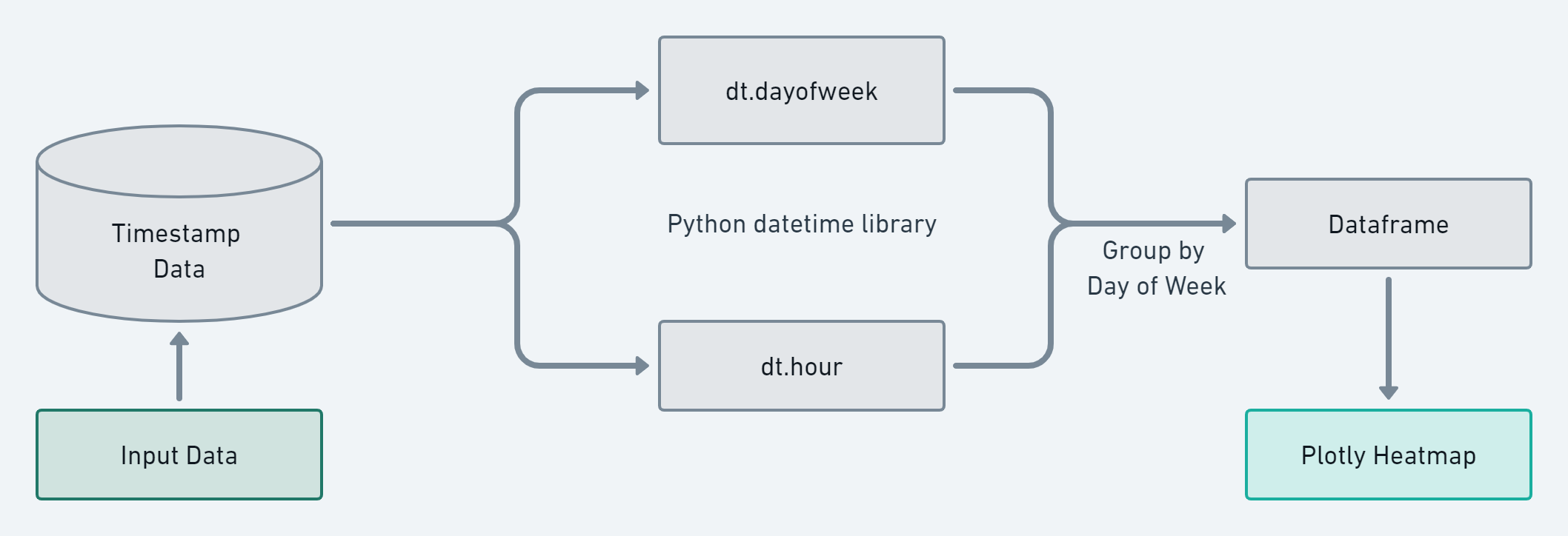
Motivation and Game Plan
Recently I wanted to build a tool to visualize timestamp data, specifically to display a heatmap of activity by hour and day of week.
I started off by reading over this tutorial. I found this guide to be a little difficult to fully comprehend and wanted to share further information on the topic. My objective was to create a generic python utility for parsing timstamp data into heatmap graphics.

Code Walk Through
The finished python code can be found on github: HeatMapViz.py.
First we define the base data that use to populate the heat map later on. This contains every hour of every day of the week.
1
2
3
4
5
6
7
8
9
10
DoW_hours = {'Monday': {'0':0, '1':0, '2':0, '3':0, '4':0, '5':0,
        '6':0, '7':0, '8':0, '9':0, '10':0, '11':0,
        '12':0, '13':0, '14':0, '15':0, '16':0, '17':0,
        '18':0, '19':0, '20':0, '21':0, '22':0, '23': 0},
<...trimmed...>
'Sunday': {'0':0, '1':0, '2':0, '3':0, '4':0, '5':0,
        '6':0, '7':0, '8':0, '9':0, '10':0, '11':0,
        '12':0, '13':0, '14':0, '15':0, '16':0, '17':0,
        '18':0, '19':0, '20':0, '21':0, '22':0, '23': 0},
}
df_times is the dataframe of timestamp data to analyze, it’s set when HeatMapViz is initiated. Here we format the dataframe to ensure the datatime library can parse properly later.
1
2
df_times = pd.to_datetime(df_times, format='%Y-%m-%d %H:%M:%S')
df_times = pd.DataFrame(df_times,columns =['index'])
Iterate through the timestamp data, get the day of week and hour. This uses “groupby” structure the data before we incorporate it into the base dataframe of all possible time on the heatmap.
1
2
3
4
5
6
7
8
for idx, gp in df_times.groupby(df_times['index'].dt.dayofweek):

    DOW = gp['index'].dt.day_name().iloc[0]

    hour_block = gp.groupby(gp['index'].dt.hour).size()

    for hour, count_value in hour_block.items():
        DoW_hours[DOW][str(hour)] = count_value
Now that we’ve analyzed the timestamp data and incorporated it back into dataframe for the heatmap called “DoW_hours” we can use plotly to graph this. The plotly documentation has further info on the imshow function used here.
1
2
3
4
fig_data = px.imshow(heatmap_df, labels=dict(x="Day of Week", y="Hour of the Day (UTC)",  color="Occurrences"),
        x=['Monday', 'Tuesday', 'Wednesday', 'Thursday', 'Friday', 'Saturday', 'Sunday'],
        y=['0', '1', '2', '3', '4', '5', '6', '7', '8', '9', '10', '11', '12', '13', '14', '15', '16', '17', '18', '19', '20', '21', '22', '23']
      )
Finally to generate a html report with our output data a template file is read and the figure data is appended on.
1
2
3
4
5
6
7
8
9
template = open('templates/template.html', 'r')
report_data = template.read()
template.close()

report_data += fig_data.to_html(full_html=False, include_plotlyjs='cdn')

with open('heatmap_report.html', 'w') as f:
    f.write(report_data)
Example Use Cases
When working on this project I wanted to create something that could be implemented in multiple use case. Here I will provide 2 separate scenarios: Reviewing ContiLeaks csv data and reviewing IR excel data
Analysis of Leaked Conti Ransomware Communications
By leveraging python I parsed through the Jabber logs and perform a HeatMap analysis. contleaks_viz.py
For the ContiLeaks example I looped through the ContiLeaks Jabber logs and parse lines with timestamp data:
1
2
3
4
5
6
7
timestamp_data = []
for file_path in glob('example_data/jabber_logs/*.json'):
    with open(file_path, 'r') as json_file:
        for line in json_file:
            if "\"ts\"" in line:
                line = line.replace("  \"ts\": \"","").replace("\",","").replace("\n","")
                timestamp_data.append(line)
Then used HeatMapViz to analyze this data and generate a report:
1
2
3
visualizer = HeatMapViz(timestamp_data)
heatmap = visualizer.run_timezone_heatmap()
visualizer.write_report(heatmap, "conti_report.html")
Incident Threat Actor Activity
test

